Deptford Pride
Branding, Campaigns

Taking a community Pride further than the rainbow
LGBT+ communities are continually growing and showing their own identities through the creation of new Pride flags to complement the Rainbow Flag designed by Gilbert Baker in 1978. We developed a brand that reflected the need to see beyond the rainbow to represent all communities involved.
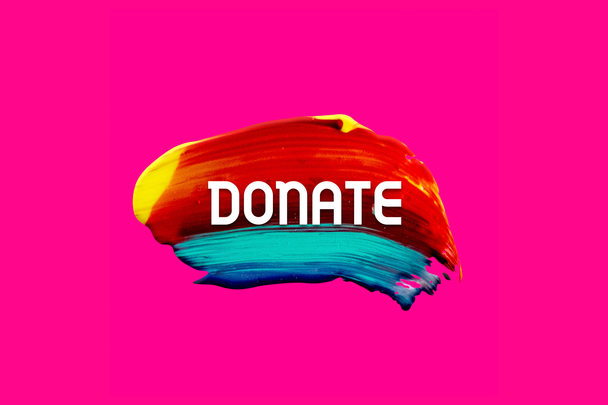
Knowing that artwork would be seen online predominantly, we created a digital first approach focused on social media content. A bright RGB colour palette—inspired by, but not copying, Gilbert Baker’s rainbow flag—complemented the paint swishes. The paint swishes were used alongside photography from the previous year’s event to build social media presence quickly and with confidence.


Life painted proud
Colours flowing into each other to create each swish represent the different identities within the LGBTQ+ communities.
Creating these swishes with acrylic paint led to surprising results as the colours mixed and merged in unpredictable ways. Photographing the paint and then manipulating them in Photoshop allowed for infinite colourways and shapes. Some swishes were kept in single colours to aid with legibility and to create additional impact when placed against contrasting backgrounds.
Six colours—Red, Orange, Fluorescent Yellow, Mint Green, Purple and Magenta—take inspiration from the six-colour Gilbert Baker flag. With the majority of Prides taking direct reference from the flag, we thought it important to “queer” the colours to reflect the rich history of protest and activism within Deptford and to better represent the event.


Raising visibility
Bespoke brushstroke lettering which had been developed for sister organisations the Deptford Society and Deptford High Street was adapted for the Deptford Pride logotype.
Type was set in uppercase Gilbert, a new font created by FontSelf to remember Gilbert Baker who died in 2017. We added a bold RGB blue to the colour palette in place of black.
A strict grid system underpinned the typographic posters, with three titling sizes for consistency and to bring order to the flurry of colour and movement.


